Pathly: Mobility-aware transit planning for temporary needs
CHRONO IS A PUBLIC TRANSIT APP USED IN MONTREAL. OUR TEAM CONDUCTED A REAL-WORLD USABILITY TEST TO IDENTIFY PAIN POINTS IN CORE FEATURES SUCH AS TRIP PLANNING, OPUS CARD RELOADING, AND SAVING FAVORITE LOCATIONS. THE GOAL WAS TO UNCOVER ACTIONABLE INSIGHTS TO IMPROVE TASK COMPLETION, NAVIGATION, AND OVERALL USER SATISFACTION.
Client
Chrono
Tools
AIRTABLE, GOOGLE FORMS, FIGMA, AUDIO RECORDING, ANDROID DEVICES
Timeline
2025
Role
UX Researcher

Deliverables
Research Focus
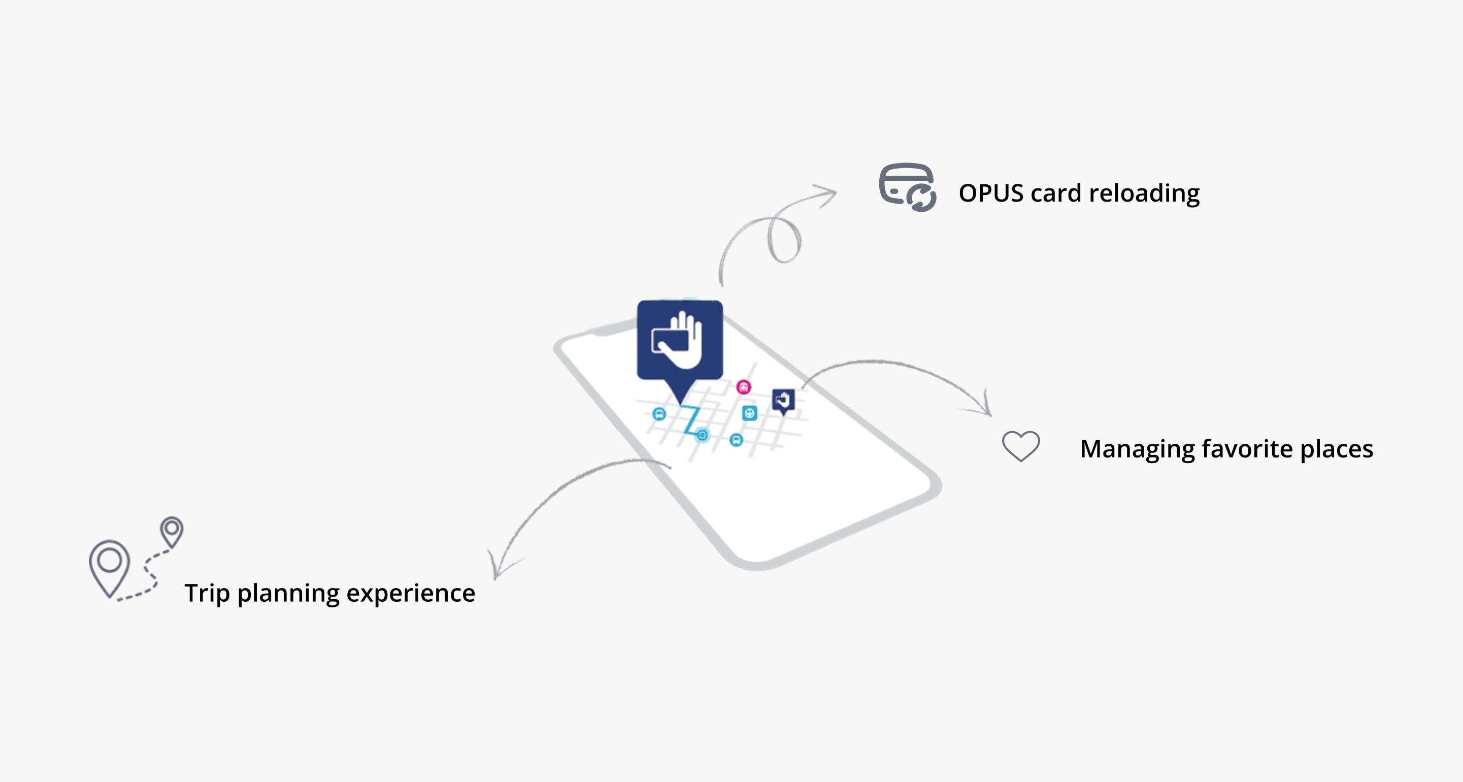
Our research explored three core aspects of Chrono’s user experience, aiming to uncover usability issues that affected daily usage compared to competing transit apps like Google Maps and Transit. Trip Planning Efficiency We examined how effectively users could plan trips within Chrono, identifying where it fell short against familiar alternatives like Google Maps in terms of flow, accuracy, and ease. OPUS Card Reload Flow We analyzed the process of reloading transit cards to see if users found it intuitive, responsive, and trustworthy—or if it introduced unnecessary friction. Icon Clarity & Favorites Functionality We assessed how clearly users understood and interacted with features like saving favorite stops or routes, and whether icon design and placement supported quick access. Despite offering essential tools, Chrono faced frequent usability complaints. Navigation felt unintuitive, iconography was often unclear, and users received little feedback during key tasks like reloading their OPUS card or saving a location. These issues became the foundation of our research focus and design recommendations.

Target Users
Intended users: Public transit users in urban areas (commuters, students, etc.)
We ended up with 6 participants, aged 24–42, all regular public transit users in Montreal.
Some participants were experienced Chrono users, while others were first-time users.
Methodology
Test Type: Moderated, in-person
Location: Near metro/bus stops to simulate real-world conditions
Participants: 6 users (ages 20–40, varied familiarity with transit apps)
Data Collected:
Task success rate
Time on task
Clicks, errors
Think-aloud observations
Post-task interviews
Test Focus Areas
Plan a trip from A to B using the app
Reload an OPUS transit card
Save a location to favorites
The goal of the test was to assess how easily users could perform common tasks.
Usability Test Plan
The purpose was to identify usability issues in the main user flows through real-time user testing and identify key pain points affecting navigation, task efficiency, and user satisfaction.
Participants: 6 users, in-person, moderated interviews.
Measures: Task success, user behavior tags (Thinking, Error), direct quotes
Think-aloud + observational coding
3 people responsible for different tasks during the test:
Note taker of quantitative data,
Note taker of qualitative information
The moderator.
Tasks
You can’t test everything, sp what should you test?
In our usability test, three tasks were carefully selected based on their relevance to core app functions and their potential impact on both user experience and business outcomes.
The matrix below reflects this prioritization strategy by weighing each task against its risk, business impact, and user impact:
Usability testing prioritization matrix adopted from NNGroup (2021), showing task evaluation based on risk, business impact, and user impact.

1= High
2= Medium
3= Low
Overview of Test Results
Overall Rating of the app:
Average Rating: 3.67 / 5
Average Age: 33.2 years
Range: 24 to 42
Primary Transportation:
Most use Public Transit
(with combinations of walking, rideshare, and driving)
Accessibility Consideration:
All participants marked No
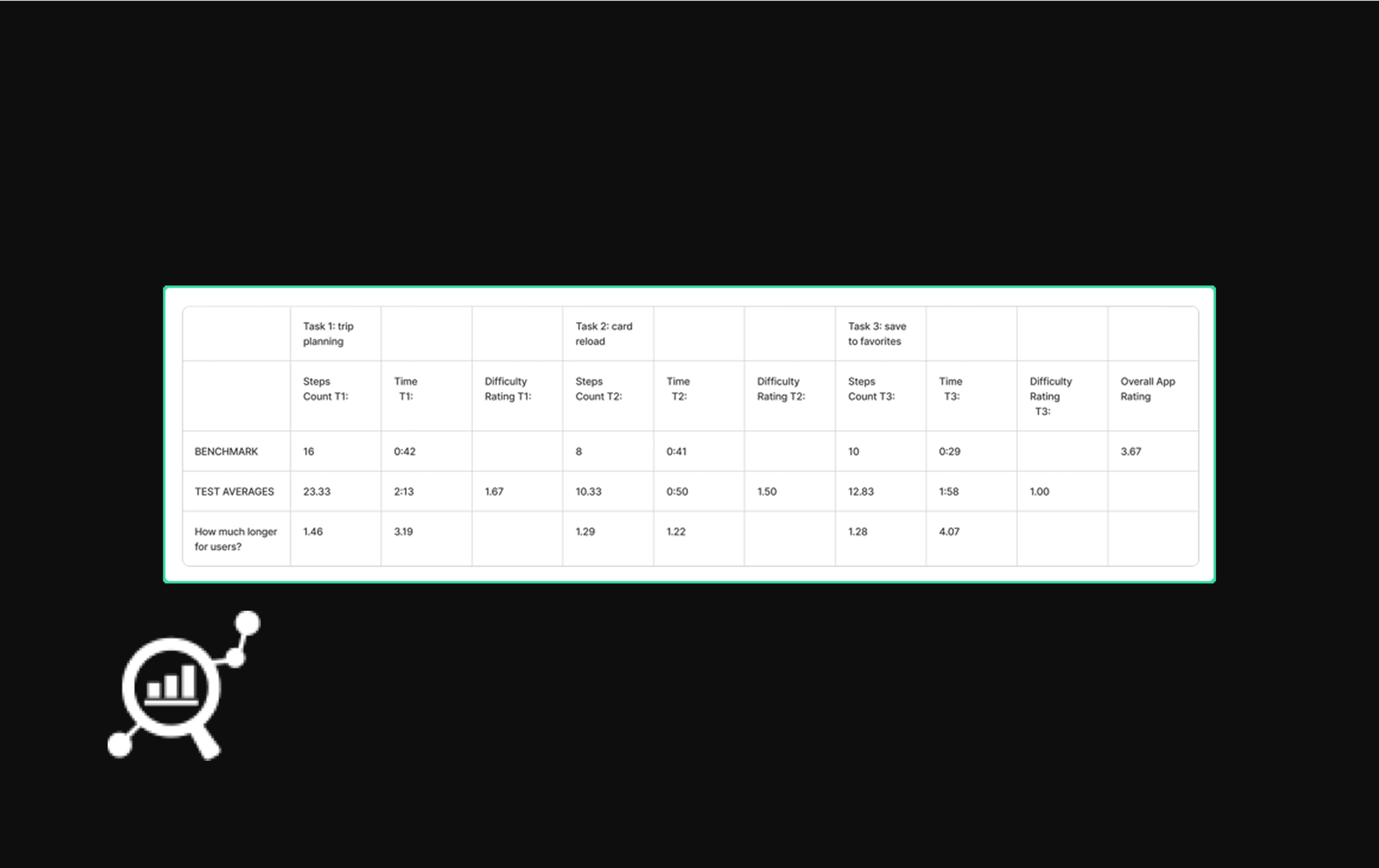
50% error rate: 9 out of 18 tasks had at least one error.
Tasks were perceived as easy, but error rates were high, suggesting users blamed themselves for issues.
Participants took longer and more steps than benchmark users to complete tasks.
Despite this, app ratings were decent, indicating a disconnect between perceived and actual usability.
Overview of Test Results
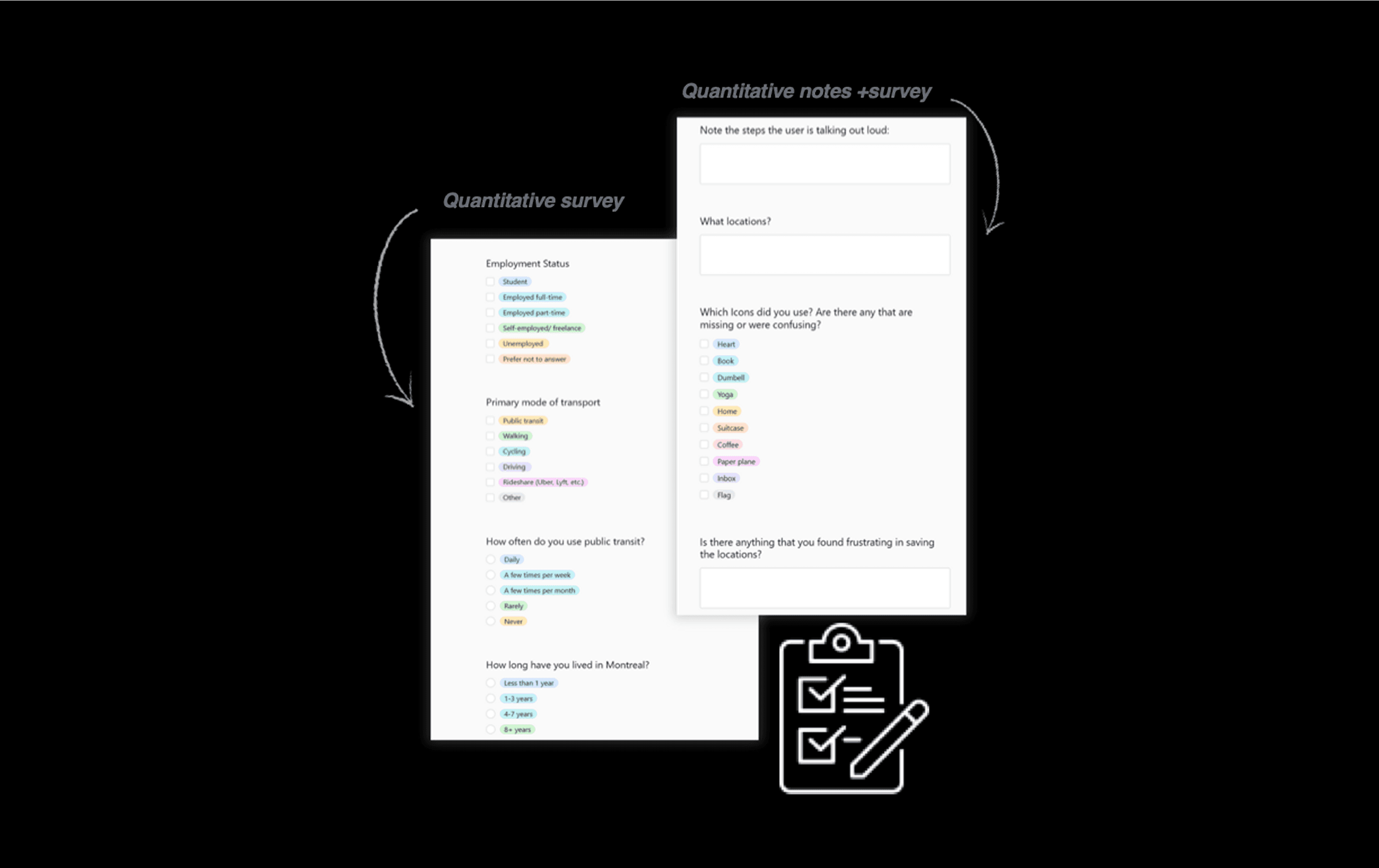
We utilized Airtable to create surveys that we filled in with participants and later analyzed the data by coding user steps and thoughts to find emerging themes.
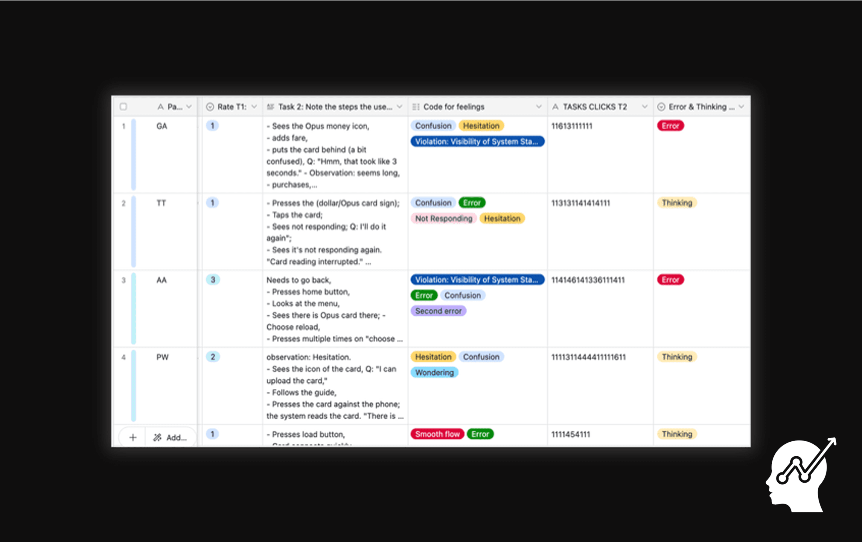
Screenshot from our Airtable coding
Key Findings
UI & Feature Expectations
Key Findings
Task-Specific Usability Issues
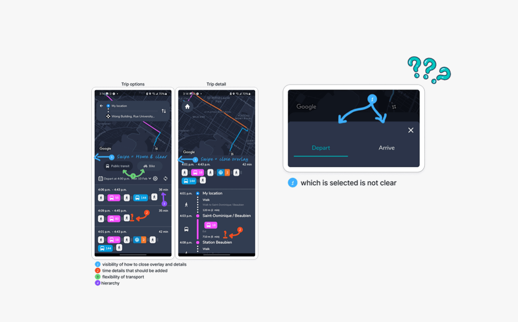
Trip Planning:
67% encountered confusion; only 2/6 completed with no errors.
No visible back button, swipe gesture not discoverable.
“I am afraid it is gonna take me back home.”
Input & Flow Issues:
No autosave or confirmation → users lost data when switching options.
"Arrive by" vs. "Depart at" confused 3/6 users.
Recommendations
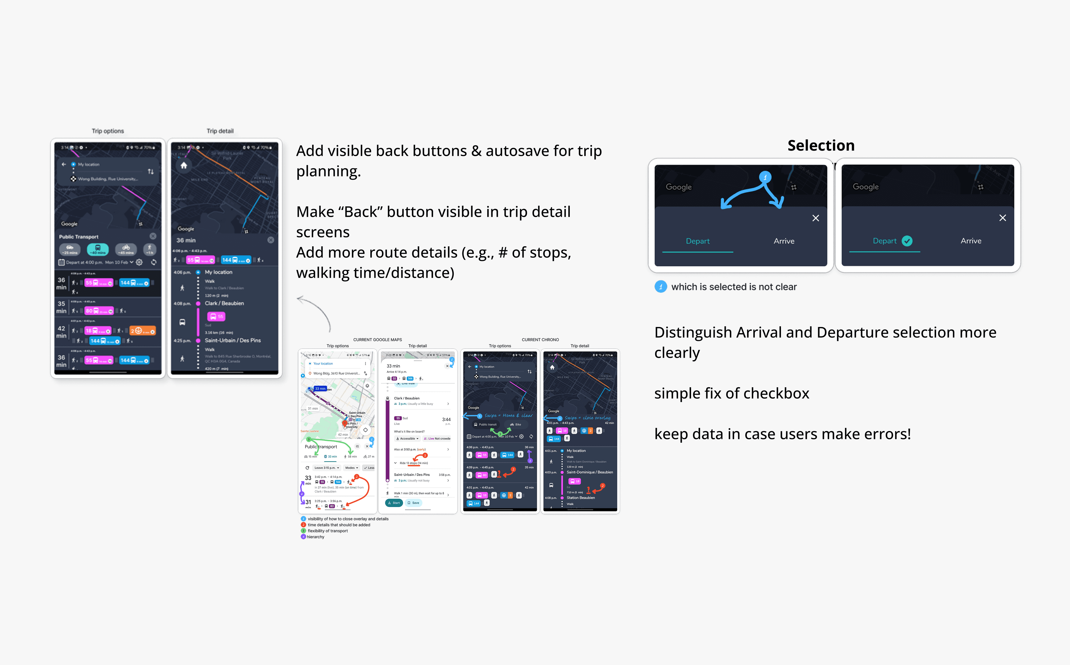
Trip Planning
Add visible back buttons & autosave for trip planning.
Make “Back” button visible in trip detail screens
Add more route details (e.g., # of stops, walking time/distance)
Distinguish Arrival and Departure selection more clearly
simple fix of checkbox
keep data in case users make errors!
Recommendations
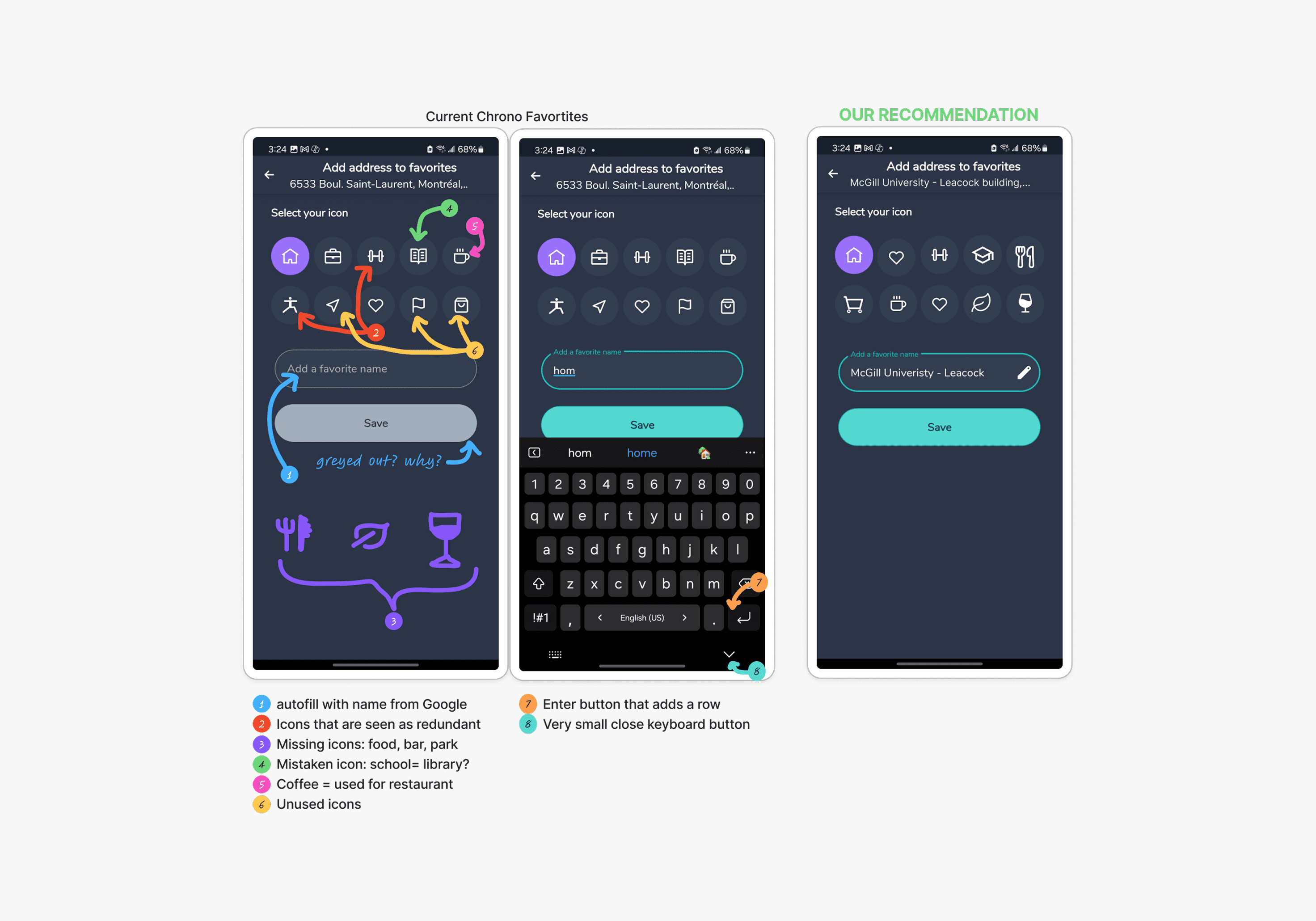
Improving the Favorites Feature
Recommendation:
Simplify and clarify the icon set using familiar, intuitive symbols (e.g., leaf for parks, fork for restaurants).
Make naming optional by auto-filling location names.
Fix the confusing "Enter" key behavior to align with user expectations.
These changes reduce cognitive load and make the Favorites feature quicker and more user-friendly.
Recommendations
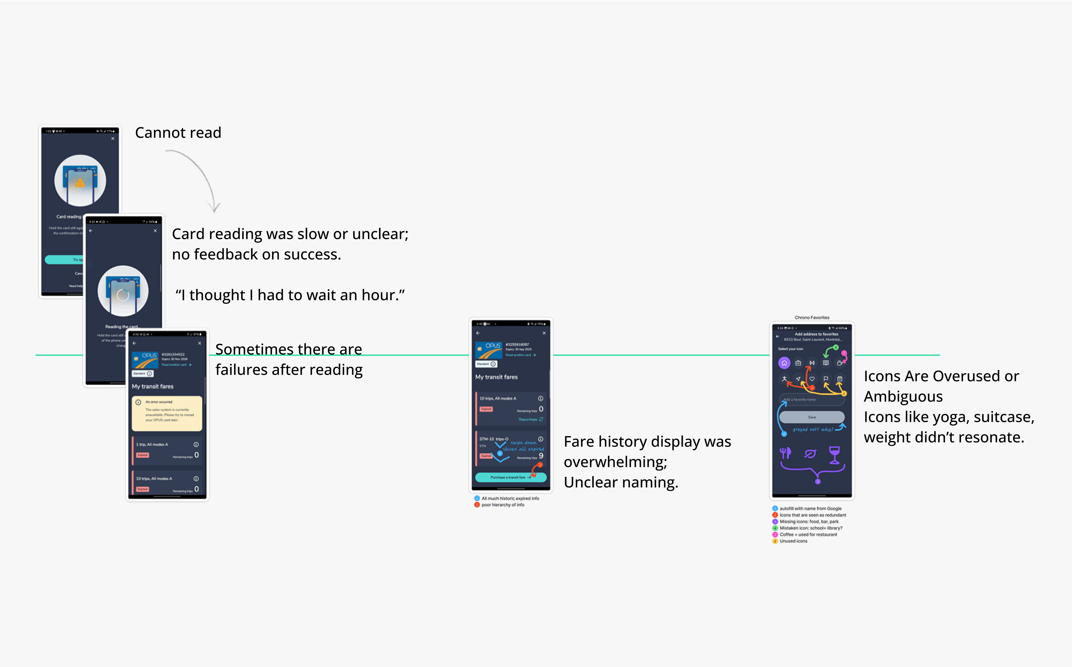
Card Loading
The reload errors need to be a priority for fixing. More testing and investigation into the card reader
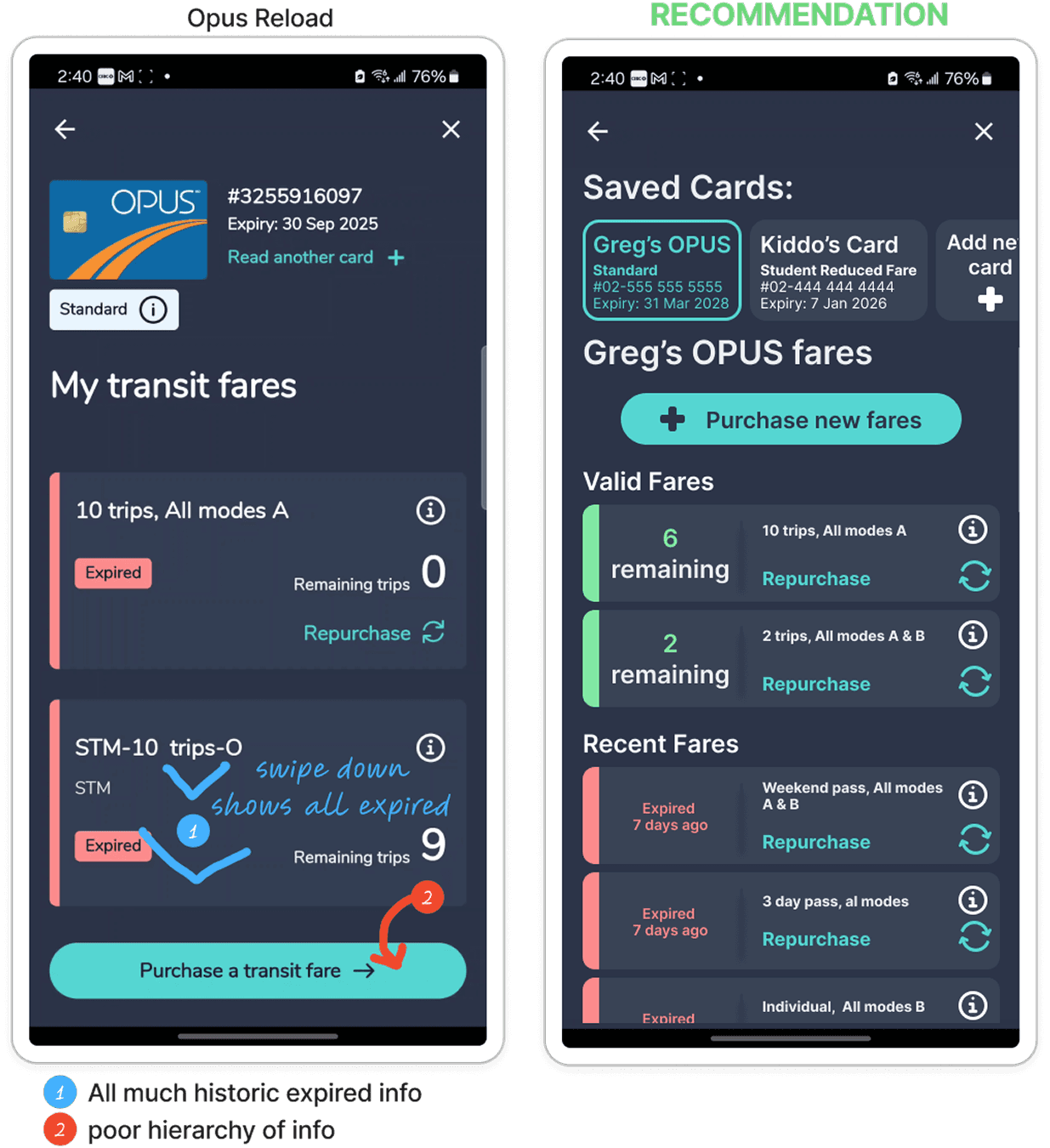
Simplify fare history UI; separate active vs expired fares.
Improve hierarchy of information for purchase
Figure 12 - Redesign recommendation for OPUS reload
Challenges & Future Work
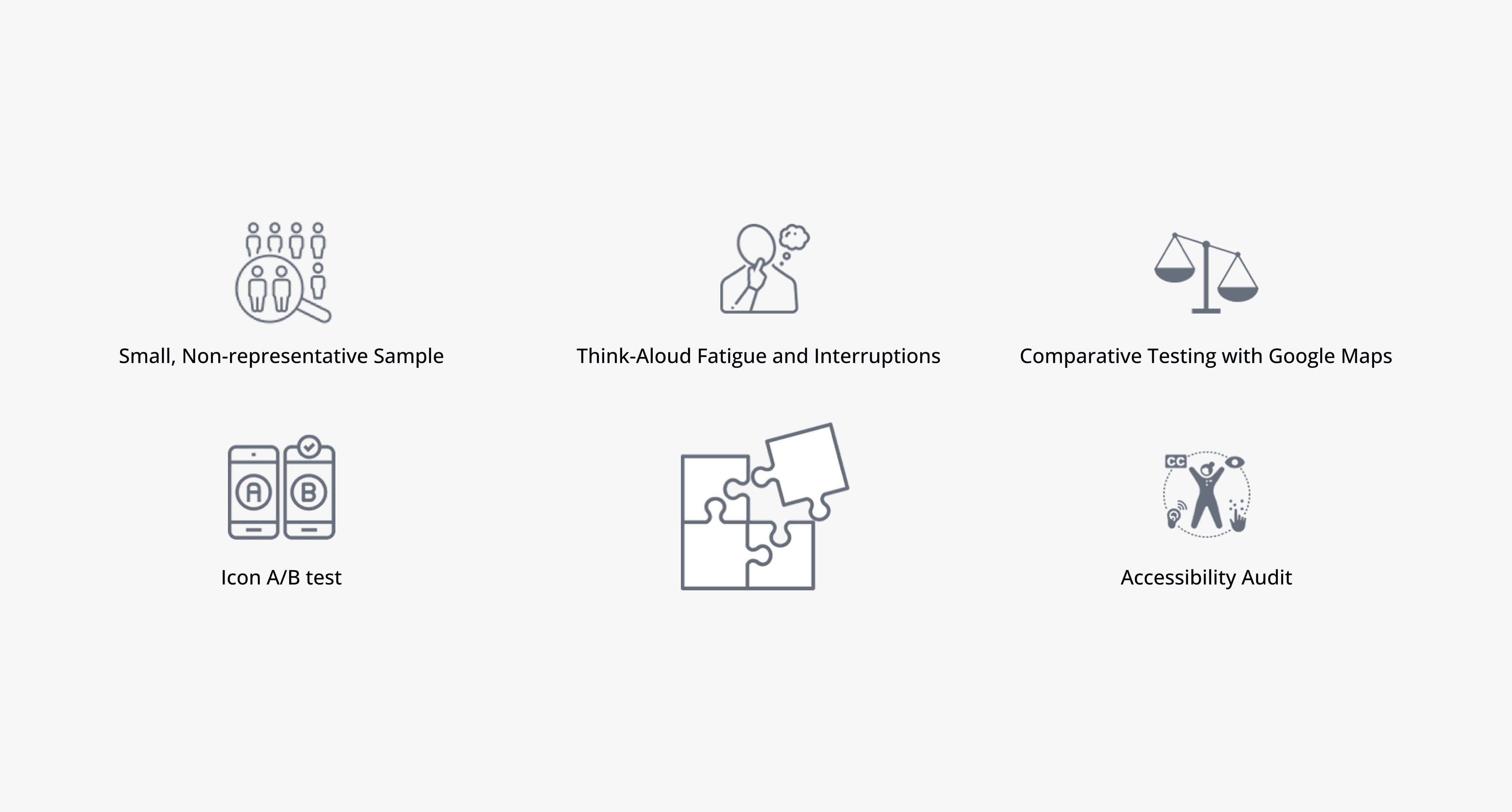
Future Research Opportunities:
Run comparative testing with Google Maps to identify must-have features.
Conduct an accessibility audit to ensure usability for users with diverse needs.
A/B test redesigned icon sets for better recognition and preference.
Gather long-term feedback by tracking user behavior post-onboarding.
Reflections
Future Research Opportunities:
Gained hands-on experience planning and moderating usability tests in real-world settings.
Realized how easily users blame themselves for poor UX—reinforcing the importance of clear, intuitive design.
Observed that think-aloud protocols affected user behavior and task timing; would try remote or repeat-task methods in future studies.
Noted the limitations of a small, non-diverse participant group—future tests should include long-term and older users for deeper insights.
This project strengthened my confidence in research and deepened my empathy for users navigating unclear interfaces.