Mindbridge
Turning a fragmented school website into one a parent can trust.

Context
Responsive Web
Methods
Competitive Analysis
user research
wireframing
prototyping
Role
Information Architect
Ux researcher
UX Designer
Timeline
FAll 2025 . 8 weeks
Project Overview
Overview
Mindbridge is a Toronto-based enrichment school with strong pedagogy and a website that hid it. I restructured the content model, taxonomy, and navigation so prospective parents could evaluate programs and start enrollment without contacting the school first.
problem
Parents were the site's primary user, and the site was built for everyone but them.
Mindbridge's website buried its own value. Prospective parents landed on a homepage running three competing navigation systems at once, with no single clear path to evaluate a program. Instructor profiles and testimonials, the content parents trusted most, sat outside the main navigation entirely.
The site wasn't missing information. It was hiding it!

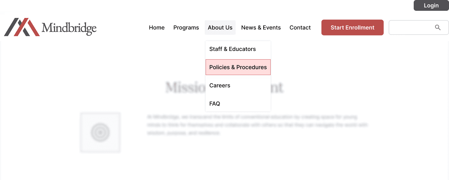
Three navigation systems were competing on one homepage, with no clear primary path.
Solution
One navigation, one hierarchy
Collapsed three bars into a single global nav with five categories and one high-priority CTA, so every page has one predictable entry point.
Content chunks, not pages
I rebuilt the site's underlying structure—reusable, tagged content chunks instead of static pages—so the same information (FAQs, policies, enrollment steps) could live wherever a parent actually needed it.

Metadata-rich program cards
Surfaced grade, schedule, outcomes, and instructor on the card itself, so parents can compare without opening five pages.

The instructor's name on the card was a direct response to the client's insight that staff quality drives enrollment.
Core Flows
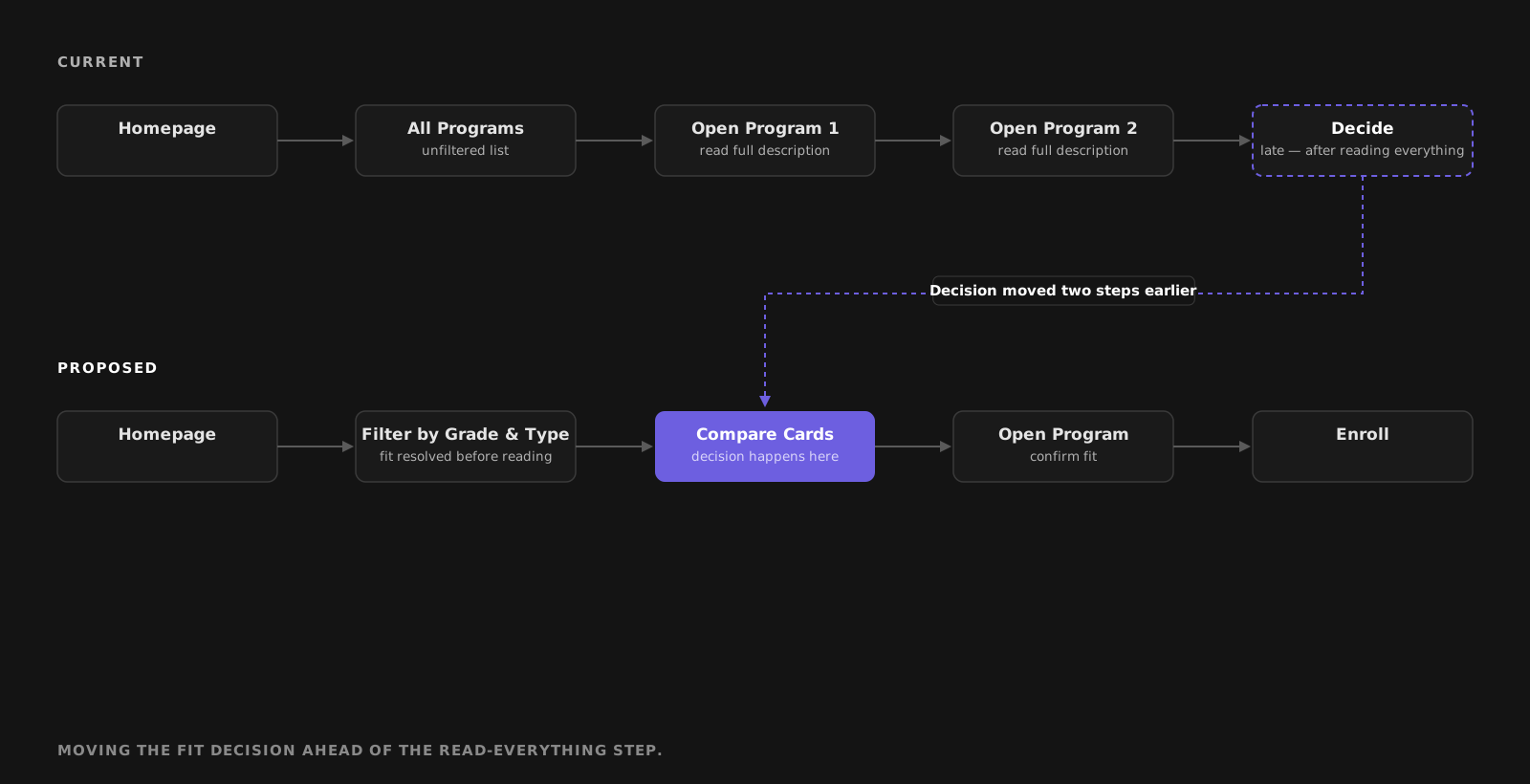
Filtering came last. It needed to come first.
The flow that carried the value was:
Evaluate

Shortlist
Enroll
Under the current site, a parent hit a decision point:
"Is this program right for my child?"
and had no way to answer it.
I moved the branch earlier. Filters resolve fit before the parent commits attention to a description. Admission criteria and the registration calendar sit inside the enrollment path rather than in News, where date-related content had previously been filed.
Dead-end states were the second problem: blog posts, news items, and event pages ended with no path upward. Breadcrumbs and a reclassification under News & Events gave every deep page a return route.
Research
It wasn't missing information. It was misplaced information.
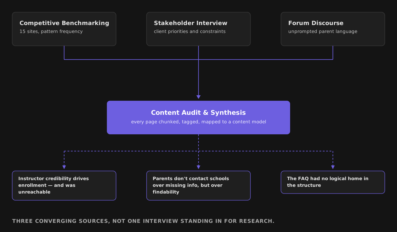
Research Question: Where does a prospective parent's evaluation break down, and is the cause missing content or misplaced content?
Method: Direct user recruitment wasn't available inside the project timeline, so I used three converging proxies rather than claiming interviews I didn't run:
Competitive benchmarking (n=15),
Stakeholder interview with the client, and
Discourse analysis of parent forums.
Benchmarking was chosen over a heuristic walkthrough because the question was about conventions—what parents have been trained to expect elsewhere—which a heuristic audit can't surface.
I ran the content inventory and audit across every page, splitting content into chunks and tagging each with the metadata a parent would need. Synthesis mapped audit findings onto a current-state content model, then a proposed one.
Competitive Analysis
15 competitor sites benchmarked
Selected for direct overlap with Mindbridge's category—private enrichment and after-school programs. I measured pattern frequency, not aesthetics: how often each site used a given navigation label, where CTAs sat, and whether search existed at all.

14 of 15 competitors converge on the same four nav categories—Mindbridge's variation reads as inconsistency, not identity.
Insights
Convention, not preference, sets expectations.
14/15 competitors used the same top-level categories; Mindbridge's variations read as errors, not personality.
Schedules are an unmet need across the category.
Few competitors made calendars easy to find, despite parents naming feasibility as a first-pass filter.
Instructor credibility drives choice.
The client identified staff quality as the top enrollment driver, yet instructor profiles were unreachable from the nav.
Assumption Killed
I entered this project assuming Mindbridge needed a search section. Benchmarking showed only 3 of 15 competitors offered it—and those three produced frequent zero-result queries. Search over an unstructured catalog would have lowered trust, not built it.

Design strategy
More pages was the right call. Search wasn't, yet.
The principle: modular over tidy. Content had to be separable from its container, so the same information could live wherever a parent needed it. That ruled out the obvious fix, which was reorganizing existing pages, because it would have rebuilt the same catch-all problem one level down.
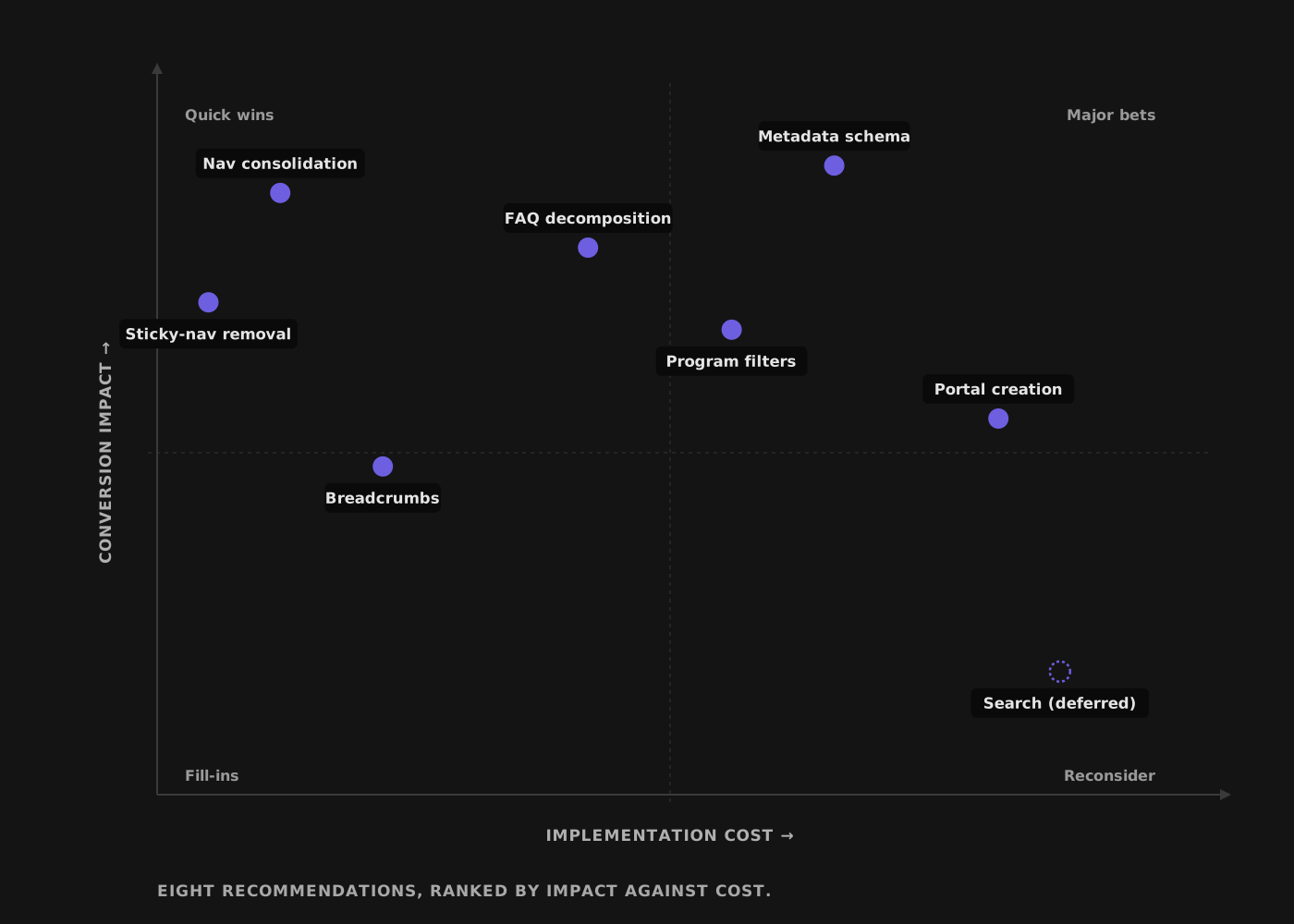
I ranked every change by conversion impact against cost, plotted against a real constraint: no dev budget, no catalog large enough yet to justify search.
Two tradeoffs. Nineteen pages instead of six—depth with hierarchy beats shallowness with orphans. And search, the most visible ask, deferred rather than built now: designed and ready, sequenced behind the metadata layer that makes it viable once the catalog grows past what filters can carry.
Success metric, set before designing: how many steps a parent needs to reach an enrollment decision.
Wireframes
Low fidelity throughout, deliberately.
The argument was structural, and greyscale wireframes kept the client's review on hierarchy rather than color.
Each wireframe set tested one question:
Can a parent orient on the homepage in one screen?
Can they compare programs without opening pages?
Does the enrollment path hold together end to end?

Keeping wireframes greyscale kept client review on structure
Reflections
The audit was the whole project. Every recommendation traced to a row in the content inventory. I now start structural work with the inventory rather than treating it as documentation.
I over-indexed on search early and spent time on a solution the catalog couldn't support. Recognizing that indexing was the real problem came from the audit, not from intuition.
The tradeoff I'd defend hardest is adding pages. It looks like the wrong direction until you see the orphan map.
What I'd change: I'd have pushed for five parent participants and a single findability task. Without it the work is well-argued and unproven, which is a weaker position than it needed to be.
If I had another month, I would run that test on the current site and the prototype, and publish the delta — even if it were flat.